Meet Tushar and Discover How He Helped Improve Truecaller for iOS
Antia Bagni
Jan 18, 20224 min readEdited on Jun 15, 2022
The roll-out of a completely new design of Truecaller for iOS is an absolute dream come true. This interface redesign is simplified and easier to use for millions of Truecaller users every day.
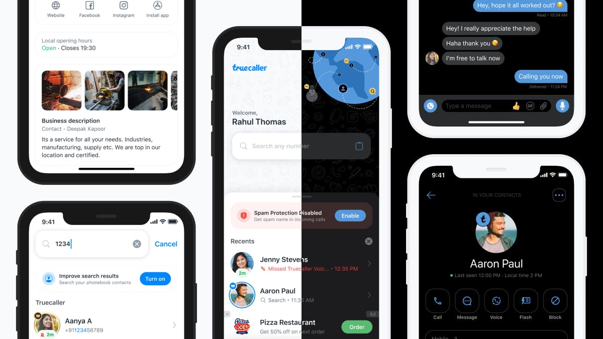
But who is behind all this? Tushar Satyanath, Senior UX Designer at Truecaller, has been essential in the design process behind this big upgrade to Truecaller for iOS.
What were the main reasons for redesigning the iOS app?
We wanted to provide a simplified user experience with a freshly updated interface. We also wanted to bring valuable information up front for our end users. These changes will significantly impact the usability of our product.
What were the issues with the previous version?
Over the years, our app has constantly evolved based on metrics and user feedback.
We noticed that most users open the app to search for a number and see details of that number. Keeping that in mind, we chose to bring our search feature to the forefront of this redesign. Apart from the usability of its features, the previous interface did not leverage some of the UI components available in the latest software updates.
What was the process of redesigning the app?
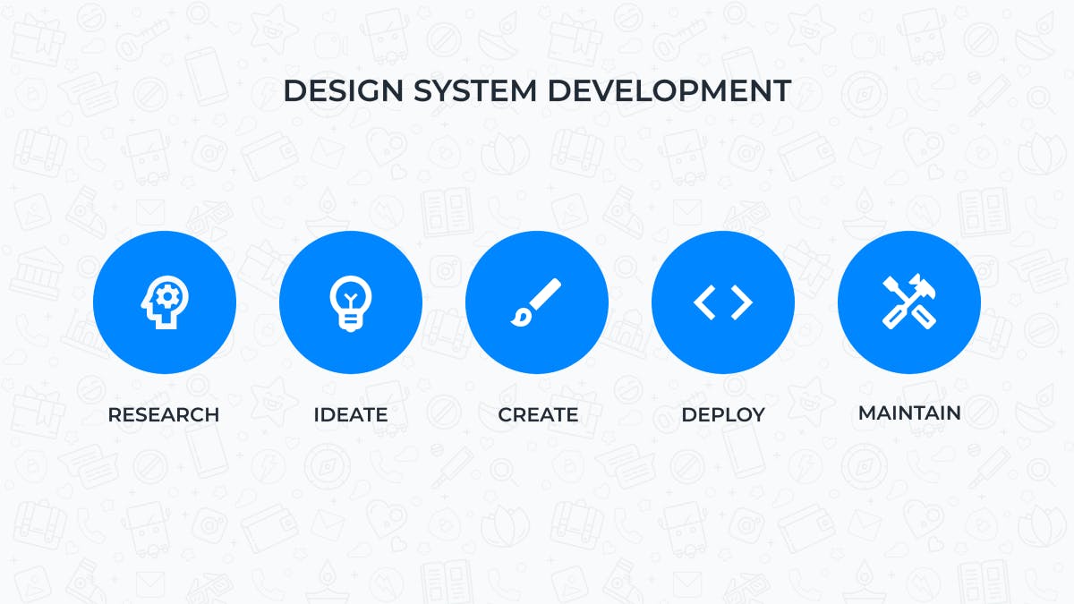
We kicked off by underlying what the goal of the redesigned app should be. This allowed the entire team to envision the bigger picture. Our product team then got together to brainstorm and assess what would be the best solutions to achieve our end goal. Once we had a clear understanding of the direction we were heading, I started evaluating the potential solutions and began building the design system.
The new re-design is one important step in the right direction.
- Alan Mamedi, CEO of Truecaller
How do you know which design decisions are the right ones? How do you prove a thesis?
Knowing which design is the ‘right’ one is never easy. Empathising with our users is critical in our decision making process. It’s our responsibility to listen to their valuable feedback, analyse usability metrics, and adapt our assumptions accordingly. It’s also important to experiment sometimes and learn from the user interaction across markets. This enables us to validate the product vision, create insights and improve our design approach.
How was the design system built?
Once I had a sense of our product vision, I prepared some ideas for the redesign process.
I started by creating versions of our landing page through rough wireframes and prototypes. Meanwhile, I researched design trends, the latest iOS features and gathered visual design cues from various open source platforms. Next, I created high-fidelity screens with variants of UI elements and colour styles. After some deliberation and a few discarded ideas, our team fixed on a style that could extend beyond just the landing screen. It was at that moment I began constructing and creating specifications for all the individual components.
Why is a design system important?
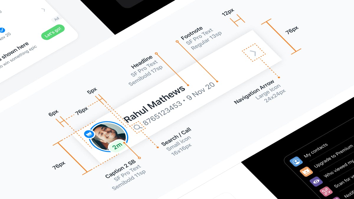
Design systems are essential for bridging the gap between design and engineering.
It has significant benefits for teams to collaborate without re-inventing the wheel with every new project.
For example, if a text style change is required, one can simply update the core components in the design system and avoid rebuilding each screen from scratch.
Another advantage is that engineers can follow the same specifications and have cross-functional collaboration using predetermined guidelines. This avoids any inconsistencies in the long run.
Which were the main tools that you used?
I start all my processes with notes and small sketches. But the primary tool that I used to create the design system was Figma. It is a powerful medium that enables cross-team collaboration. Other tools used for illustration and animation were the Adobe Creative Cloud apps.
What were the main challenges you faced during the process?
The reception of a complete design refresh is not always positive, so one has to be open to receiving critical feedback. Next, the creation of the design system is a very crucial part of the design workflow, though it can get time-consuming. It also needs to be planned in a way that every component can be scaled across various use cases. Another factor is internal feedback. There was a unanimous decision to eliminate some of the features we had in the old app which had implications on the new concept.
What did you have in mind when redesigning the app?
Based on our research, we wanted to provide the most valuable features upfront and allow for feature discovery. As mentioned earlier, we wanted to cater to the primary use case of searching numbers with an all new landing screen. We also needed to add some hints and pointers to users to get the best out of Spam Protection.
What’s next for the iOS app?
Truecaller’s iOS app has a significant and loyal user base. This redesign is the first step into a series of initiatives that we are taking with our iOS app.
Even though there are technical limitations on iOS that might not allow us to provide the same experience as on Android, we are committed to supplying everything to maximise spam protection.
In the future, we will push the boundaries to provide a lot more sophisticated features which will make communication smarter, safer, and more efficient.
Do you want to know more about Tushar? Discover his journey at Truecaller throughout all these years. You can find more stories behind the code on our blog. You can also connect with us on Linkedin, follow our “Behind the Code” series on Youtube, and discover how it is to work at Truecaller on Instagram.

Antia Bagni
Jan 18, 20224 min read
